


If you’ve noticed an increasing number of websites switching to dark mode or offering users the option to toggle between light and dark themes, you’re not alone. Dark mode in website design is no longer a trendy afterthought—it’s a design element that’s becoming a staple in modern web development. But is it just a visual preference, or does it come with usability benefits and strategic advantages for your website? Let’s dive into the pros and cons of dark mode and explore when it’s appropriate to integrate this feature into your site.
The Popularity of Dark Mode in Website Design
Dark mode is everywhere—from social media platforms like Twitter and Instagram to software applications like Slack and Microsoft Teams. But why has it gained so much popularity? The shift towards dark interfaces is driven by several factors:
- Aesthetic Appeal: Dark mode brings a sleek, modern look that appeals to users who prefer a minimalistic and tech-savvy vibe.
- Eye Comfort: Especially in low-light environments, dark mode reduces the glare from bright screens, which many users find more comfortable for extended viewing periods.
- Battery Saving: On devices with OLED or AMOLED screens, dark mode can save battery life by reducing the amount of light the screen emits.
But does the hype translate into real-world usability benefits, or is it just about personal preference?
The Usability Benefits of Dark Mode in Website Design

1. Reduced Eye Strain
One of the most commonly cited benefits of dark mode is its potential to reduce eye strain, particularly in dimly lit environments. Bright white screens can feel harsh and fatiguing after prolonged exposure. Dark mode, on the other hand, uses dimmer tones that many users report as being gentler on their eyes, especially during nighttime usage.
However, studies have shown that dark mode is not universally better for reading and comprehension in all situations. For example, reading long passages of text may still be easier with light backgrounds, as dark text on a light background tends to offer better contrast and readability in bright environments.
2. Improved Focus
Dark mode creates a low-distraction environment, allowing design elements like images, videos, and important calls to action to stand out more effectively. This is particularly useful on media-heavy websites or when showcasing portfolios, as the dark background puts the content in the spotlight.
3. Battery Efficiency
As mentioned earlier, dark mode can save battery life on OLED and AMOLED displays by reducing pixel brightness. This benefit isn’t universal (it doesn’t apply to LCD screens), but it’s a strong consideration for mobile-heavy sites. With mobile browsing consistently on the rise, implementing dark mode could help extend the battery life of your users’ devices.
4. Better Accessibility for Certain Users
For users with visual impairments such as photophobia (light sensitivity), dark mode offers an option that reduces discomfort. It’s worth considering whether your audience includes a significant number of users with these types of conditions, as offering dark mode can make your site more accessible and inclusive.
The Drawbacks of Dark Mode in Website Design
Of course, dark mode isn’t a magic solution for all websites. Here are a few reasons why it might not be the best fit in certain cases:
1. Readability Challenges
While dark mode can look fantastic in some contexts, text-heavy websites may suffer. Extended reading on dark backgrounds can actually be more difficult, especially in well-lit environments, where glare from ambient light can reduce the legibility of light text on a dark background. Studies show that high contrast in dark mode (light text on dark backgrounds) can result in halation (a glowing effect around the text), which can hinder readability.
2. Branding Conflicts
If your website’s branding relies on bright, vibrant colors, dark mode might dull the visual impact of your design. Some brand colors may not stand out or may look completely different in a dark theme. You’ll need to carefully consider how your brand identity is presented and whether dark mode will help or hurt your overall design strategy.
3. Design Inconsistencies
Not all design elements translate seamlessly from light mode to dark mode. For instance, images or logos with transparent backgrounds may need rework to display correctly on dark backgrounds. Additionally, some elements that look polished and professional in light mode can appear muddy or amateurish in dark mode if not carefully optimized.
4. User Preferences May Vary
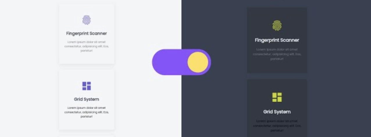
Not everyone prefers dark mode in website design, and forcing it on your users can backfire. Some individuals may find dark mode harder to read or less visually appealing. Offering the ability to toggle between light and dark modes is a better approach, allowing users to choose the mode that best suits their preferences.
When Should You Use Dark Mode in Website Design?
Dark mode has clear advantages in specific contexts, but it’s not a one-size-fits-all solution. Here’s when it makes sense to integrate dark mode into your website design:
- Media-Rich Websites: If your site focuses on visual content—think photography portfolios, video showcases, or art galleries—dark mode can help your content stand out while providing a sleek, modern aesthetic.
- Mobile-First Design: With mobile traffic dominating the web, the battery-saving benefits of dark mode on OLED screens can’t be overlooked. If your audience accesses your site primarily via mobile devices, dark mode may improve the user experience.
- User-Controlled Settings: Offering dark mode as an option rather than the default ensures you’re catering to all users. Letting your visitors toggle between light and dark modes offers flexibility and user empowerment.
- Evening or Low-Light Viewing: For sites that expect heavy nighttime usage—news sites, entertainment platforms, or social media—dark mode can be a welcome relief for users browsing in low-light environments.
Implementing Dark Mode Effectively
If you decide to offer dark mode on your site, here are a few best practices to keep in mind:
- Ensure Contrast: Ensure enough contrast between background and foreground elements for legibility. Use tools like the WebAIM contrast checker to verify your contrast ratios meet accessibility guidelines.
- Test Responsiveness: Design for both modes from the start. Images, graphics, and interactive elements should be tested to ensure they look great and function properly in both light and dark themes.
- Provide User Control: Always offer an easy way for users to switch between dark and light modes. Popular frameworks like Tailwind CSS or Bootstrap offer built-in support for dark mode implementation, making this feature simple to integrate.
Conclusion: Is Dark Mode Right for Your Website?
Incorporating dark mode into your website design is a powerful way to enhance user experience, particularly in visually rich, mobile-heavy, or low-light environments. However, it’s not the best fit for every site, particularly those with text-heavy content or branding that relies on vibrant, bright colors. The key is to evaluate your audience’s needs, your brand’s identity, and your website’s usability goals before jumping on the dark mode bandwagon.
Have you considered implementing dark mode on your site? Share your thoughts in the comments and let us know how you think dark mode could enhance (or detract from) your website’s design.
For more insights on the latest web design trends and best practices, explore our resources or contact us at TrevNet Media for expert advice tailored to your business. Don’t forget to check out our portfolio to see how we have incorporated dark mode in website design in our work.